
With mobile sales recently overtaking desktop sales, it is not out of the question to predict that mobile internet use will soon overtake desktop internet use as well. The availability of mobile internet is simply too much of a convenience for people to ignore, and the current trend is only likely to continue. Google is recommending websites focus on a responsive web design in order to be successful in the coming year.
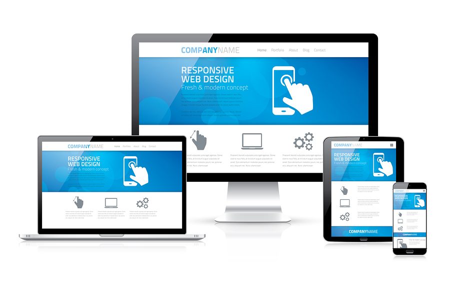
Responsive web design, in simple terms, means a web page adapts to the screen size of the device on which it’s being viewed. This allows for optimal viewing of the website whether it is being accessed on a desktop computer or a smartphone, which can go a long way toward encouraging higher viewership.
The reasons for responsive web design are fairly obvious. If a page is not formatted for a smartphone screen, the font may be too small for users to read. A user could zoom in to read the text, but may only be able to read a few words at a time – something many users find annoying. In other cases, perhaps the links on the page are non-responsive and do not send users where you’d like them to go.
Using responsive web design fixes these problems, allowing a site to recognize the device it is being viewed on and adapt accordingly. Perhaps you’ve noticed that when you visit a webpage on your smartphone, the page is labeled “mobile view” or “mobile” at the bottom. This indicates the page is being viewed on a smartphone, and the formatting of the page has been specifically designed for smartphone visitors.
Many websites, when viewed on a mobile device, also include “classic view” as a possible option, which enables viewers to view the page as it would appear on a desktop computer. Some users prefer this setting, even if it does make the text harder to read, because they are used to viewing the page on a desktop. Familiarity with one setting can create bias against or for the other setting.
Responsive web design can mean some features are available in desktop mode but not in mobile settings . For example, some Flash technology or graphics can fill up space when using desktop settings. Since space is the one major limitation of a smartphone, it makes sense to hide some content for mobile settings.
What responsive web design focuses on most is flexibility. When a page is adapted for a mobile device, the screen resolution, font, images, and style of the page must all change. In addition to the other components, having flexible images that can change in size and resolution depending on the device is very important. After all, changing the size of the font won’t do very much good if the pictures on the page are still formatted for a 15 inch screen.
Ensuring the screen resolution changes to accommodate the smaller screen is another important aspect of responsive web design. There are many different mobile devices, and many of them have very different screen sizes. Having one standard screen size for a desktop computer and one standard resolution for a smartphone is simply not going to work. Keeping the website flexible is a necessity. Having fluid grids, fluid images, and fluid websites in general is the way that many companies are addressing the fact their websites are being viewed on a variety of devices.
Of course, for some time it wasn’t necessary for all websites to have a mobile version and a desktop version. After all, the mobile market did not really begin to explode until around 2007, when there were 400 million mobile internet users . Three years later, that amount had doubled, and it is estimated that mobile internet usage will overtake desktop internet usage by next year.
Since mobile internet is increasing so quickly, it is recommended for most websites to become mobile friendly, for several reasons:
- If you do not use responsive web design, it is entirely possible you will lose clients as a result. Having a traditional web design in an age when many viewers will be on mobile devices is simply not a good idea.
- It is much easier to track visits to your website if you have responsive web design. There is no need for extra software or multiple reports when trying to analyze how well your website is performing.
- Having two separate websites, one for mobile users and one for desktop computers, can negatively affect your SEO results. If web crawlers see the site as having duplicate content, it may be ranked lower than other sites. Having one site compatible with all devices ensures consistent SEO rankings.
- It’s less expensive to pay for one responsive website than to pay for two websites, one mobile and one traditional.
- It’s far easier to manage one website that can be viewed by multiple devices than to manage several device specific sites.
Typically, it is wiser in today’s increasingly tech-savvy marketplace for all websites to be responsive. Websites on which customers can browse selections of clothing or other products and make purchases, would highly benefit from responsive web design. Travel websites, where customers are likely to browse while trying to find the best activities when visiting an unfamiliar city, are also great candidates for responsive web design.
Below are a few of the best responsive sites :
- Mashable : A news website, Mashable shares trending news stories about a wide variety of high-interest topics.
- Travel Oregon : This travel website that features incredible pictures from Oregon as well as some tips and advice on activities and adventures to enjoy while visiting the state.
- Oxford Dictionaries : Despite being one of the older brands still in business, Oxford Dictionaries offers an easy to use mobile internet dictionary.
- Capital One : This website makes online banking and credit card business simple and efficient from a mobile device or a desktop.
For more information on responsive web design, or to find out how to customize a responsive web page of your own, contact us at Find Me A Business.